Moove — Schedule Autopilot
Designing the interface that lets dairy cooperatives trust a machine learning engine with their most expensive weekly decision — where to send hundreds of loads of raw milk.

Role
Sole Designer
Company
Milk Moovement
Industry
AgriTech · Logistics
Duration
~8 Months
Platform
Web App · B2B SaaS
0%
Transportation cost reduction in year one for California Dairies
30-40%
Workflow efficiency improvement for transportation admins
0%
Schedule efficiency improvement (DataDog + qualitative research)
0+
Loads per week matched by the AI scheduler for major co-ops
00 / Overview
Every gallon has a destination problem.
This is the story of designing an AI scheduling tool that had to be trustworthy before it could be trusted.
Dairy cooperative transportation teams build weekly schedules by hand. Each week, a scheduling admin looks at hundreds of unassigned route loads — milk sitting at farms waiting to be picked up — and manually decides which processing plant each load should go to.
It sounds manageable until you understand the variables: processor demand fluctuates daily, plant receiving windows open and close due to equipment breakdowns, protein thresholds and hauler contracts all change the math.
Moove was the ML-powered scheduling engine we built to close that gap. My job was to design the system that would let non-technical users configure, trust, and ultimately own a machine making hundreds of routing decisions at once.
The Core Design Challenge
Building an interface that bridges the gap between what an algorithm optimizes and what a transportation admin needs to feel in control.
Key Collaborators
Product Manager, Tech Lead, Data Engineers, AI Architects — and direct collaboration with clients at CDI, UDA, and DFO.
Tools & Methods
Figma, Figma Make (prototyping), Bolt (data-heavy prototypes), DataDog (behavioral analysis), FullStory, client co-design sessions.
TL;DR — Watch it in action
See the finished design before diving in
Short on time? Here's a 4-minute walkthrough of the final Autopilot interface — the full case study below explains the research and decisions behind it.
01 / Problem
Manual scheduling is expensive by design.
CDI's transportation team faces significant challenges in manually selecting optimal processors for weekly schedules.
Manual Selection Process
Labor-intensive process of manually matching optimal processors for weekly schedules — complicated by fluctuating milk production, changing customer demands, and dynamic market conditions. Leads to suboptimal outcomes, higher costs, and lacks visibility into economic implications.
Time Constraints
The manual scheduling process lacks time to thoroughly evaluate all potential outcomes. This hinders the creation of cost-effective schedules and exploration of operational improvements — missing opportunities for cost savings and efficiency enhancements.
Lack of Agility
The manual nature makes it difficult to adapt to sudden changes or unforeseen circumstances — common in the dynamic dairy industry. Results in missed opportunities for optimization and operational improvements.
Need for Automation
A clear need emerged for an automated solution to process complex variables, rapidly evaluate multiple scenarios, and generate optimized schedules — maximizing efficiency, minimizing costs, and enhancing operational agility.
The initial trigger came from Dairy Farmers of Ontario (DFO), then expanded into a commercial contract with California Dairies Inc. (CDI). The promise: automated load matching, 50% reduction in scheduling time, and measurable hauling cost savings — priced as a savings-share model where Milk Moovement took 15% of the savings it generated.
02 / Research
Understanding the scheduler's mental model.
Before designing any automation, we needed to understand exactly how experts made scheduling decisions — and what made them feel confident.
We ran structured interviews with three scheduling admins across CDI and DFO. Each session involved a live think-aloud of their weekly scheduling workflow, followed by a deep-dive into how they weigh trade-offs when multiple processors have similar costs.
The insight that changed everything: admins didn't want the algorithm to just give them the answer. They wanted to understand why a schedule was good — so they could catch the cases where it was wrong.
Research Methods
Research Participants

Customer Optimization Priority Map
Research revealed that each co-op had a distinct hierarchy of what the algorithm should optimize for. This directly shaped how I designed the criteria interface.
Co-op
Supl. Cost
Base Cost
Distance
Protein Level
Butterfat Level
Appt. Time
CDI
3
2
1
-
-
-
UDA
-
-
4
2
3
1
Prairie Farms
1
-
2
-
-
-
MMPA
2
-
-
-
-
1
1 = highest priority. A single fixed optimization approach would fail all of them.
Trust is earned incrementally
Admins won't delegate decisions to a machine they haven't seen fail gracefully first. Every unexplained output erodes confidence faster than it builds it.
Cost is not the only variable
Relationship decisions, plant reliability history, and informal rules-of-thumb frequently override cost optimization. The algorithm needs to surface — not replace — this expertise.
The override UI is the trust UI
Schedulers tested the algorithm by manually overriding its decisions. If overrides were easy and visible, they felt safe trusting the defaults.
Explanations must be in domain language
'Lower haul cost' landed. 'Optimization score improved by 12%' did not. Every insight needed to connect to a number the admin already tracked.
Design Question
How do you design a sandbox that gives users confidence without making it feel like extra work?
03 / Requirements
Three layers. One coherent system.
From research and close collaboration with the PM and data engineering team, we aligned on a layered architecture for the product. Three layers emerged — each solving a different class of design problem.
Layer
What it covers
Design problem
Priority
Constraints
Plant-level rules the algorithm must respect before any optimization — eligible producers/haulers, trailer specs, protein thresholds, bay schedules, receiving windows, priority vs. balancing plant classification.
How do you make 100+ rules per plant feel manageable without hiding critical configuration?
Optimization Criteria
The signals the algorithm uses to rank possible matches — route cost, distance, or component pricing (protein/fat-based value routing).
How do you surface complex ML criteria to domain experts who have zero ML background?
Scheduling Interface
The core scheduling page — now serving both daily workflow and the AI-assisted matching workflow — with sandbox review, accept/reject, and apply-to-production controls.
How do you design a sandbox that gives users confidence without making it feel like extra work?
Demand Visibility
Plant demand inputs (per milk type, per day) and a supply-vs-demand read across the full week that updates as the algorithm matches loads.
How do you show supply-demand balance across 12+ plants and 7 days in a scannable format?
Audit & Override
Per-load alternative match suggestions with cost/distance comparisons, warning flags for constraint violations, undo/redo for accepted matches.
How do you preserve human authority without undermining trust in the algorithm?
04 / Designs
Three design challenges. One coherent experience.
Each part of the product required a different kind of design judgment — from dense configuration UIs to a full rethink of how scheduling pages should work.
Constraints — Plant Demand, Plant Profile & Bay Management
The foundation that made everything else possible. Without accurate constraints, the algorithm had no valid search space.
Plant Demand Page
The demand side needed to live in its own view, separate from the supply schedule. I designed a weekly demand page that showed each plant alongside its scheduled amount, actual demand, and the difference — giving scheduling admins an immediate read on where supply was tracking to meet commitments.
The page supported milk-type differentiation by client. For CDI, demand was tagged by type (organic, kosher, on-demand conventional). For simpler clients, everything was conventional. The system was flexible enough to accommodate both without requiring either to work around the other's configuration.


Plant Profile — Rule Configuration
Each plant got a dedicated configuration panel where scheduling admins could define the rules the algorithm had to respect before any optimization ran.
Plant Type
On-demand, Organic, Kosher — determines which milk types can be routed to this plant
Receiving Priority
Priority Plants always receive loads first. Balancing Plants receive remaining supply to a configured minimum fill rate.
Trailer Constraints
Acceptable trailer types, minimum and maximum load sizes — prevents impossible assignments before they're suggested
Component Requirements
Protein minimums, protein-priority flag, and ranked order among plants for high-component loads
Bay Management
Plants receive milk into bays — physical docking stations with their own receiving schedules, capacity limits, and downtime windows. I designed a bay management view within the plant profile that allowed admins to configure each bay independently.
A plant might have four bays but only two available on a given Tuesday due to maintenance. Without bay-level configuration, the algorithm couldn't know that — and would generate a schedule that was physically impossible to execute.
Key design decision
Bay management was built as a time-based calendar within the plant profile rather than a standalone page. This kept the context — which plant, which constraints — visible at all times while configuring bay windows.

Optimization Criteria — Designing Meaningful AI Control
This required the most design judgment of the entire project. The algorithm could optimize against multiple criteria simultaneously. The question was how to surface this without requiring users to understand machine learning.
The core tension
Transportation admins are domain experts — they know dairy inside out. But they have zero background in ML. The interface had to expose meaningful control without requiring them to understand gradient descent.
How I worked with the AI team to translate criteria into design
I worked closely with data engineers and AI architects to understand precisely what each criterion was doing — not to expose the math, but to surface the right information at the right moment for users to make meaningful decisions.
CRITERIA 01
Route Cost
The algorithm evaluates hauling contracts between each producer-hauler-processor combination and calculates cost based on distance traveled. It finds the assignment that minimizes total contract cost across the full schedule — accounting for which haulers have contracts with which co-ops.
CRITERIA 02
Distance
Stripped of contract pricing, this finds the producer-hauler-processor combination that minimizes total route distance — including multi-pickup routes where one hauler collects from several farms before a single drop-off.
CRITERIA 03
Component Pricing
The most complex criterion. The algorithm maps each co-op's contracts with processors to determine which plants pay most based on milk components (protein, fat). It then routes high-component producers' milk to the plants that will pay the most for it — based on historical contract data.
The Weighted Percentage System
The rationale for a weighted system came directly from research. CDI primarily cared about distance, but still wanted some cost consideration. UDA cared about appointment time first but protein routing was a secondary priority they didn't want to lose.
A binary on/off for each criterion would have forced users to choose. A weighted system let them mirror the nuance of what they were already doing mentally every week. Weights must sum to 100% — a simple constraint that made the interface feel grounded rather than abstract.

Design decision
I deliberately did not expose the underlying algorithmic logic. Users needed to trust it, configure it, and override it when it got something wrong — not understand how it calculated scores. Simplicity was earned through deep technical understanding, not avoidance of it.

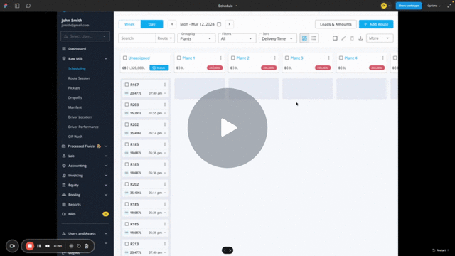
Scheduling Interface — A Mini Case Study Within the Case Study
From a card-based prototype to a client demo, to an infrastructure wall, to a full page rebuild that ended up improving the whole platform.
Design Evolution
Phase 1 — Prototype
Card UI Extended for AI Sandbox
I designed a prototype in Figma Make that extended the existing card/calendar view into a "sandbox" state. After the algorithm ran, route cards updated with color-coded match quality indicators — green for strong matches, yellow for acceptable, red for high-cost assignments. Users could expand any card to see alternative plant matches with distance and cost comparisons.
Phase 2 — Client Demo & Feedback
Prototypes Demoed to CDI & UDA
We demoed the Figma Make prototypes to clients via Loom and in live sessions. Feedback on the concept was positive. Users could see the value immediately. Then the development conversations started.
Phase 3 — The Pivot
Infrastructure Wall: Card View Can't Scale
After multiple rounds of collaboration with engineering, we hit a structural limit. The card-based UI was built on a component model that couldn't handle the data volumes Moove would generate. Running the algorithm on 850+ routes from CDI and rendering all of it in card format was too heavy. The codebase supporting the card view was too tightly coupled to make the sandbox state work cleanly. We had to go back to the drawing board.
Phase 4 — Full Redesign
List/Database UI Built from Scratch
We chose to rebuild the scheduling page as a list/database UI — adding ~1 month to scope — rather than force the AI scheduler into an architecture that couldn't support it. This decision proved correct: the new list UI shipped first as a standalone improvement and immediately improved admin workflows before Moove was even live.
Phase 5 — AI Scheduler on New Foundation
Moove Launched on the List UI
With the list UI as a foundation, I designed the Schedule Autopilot as a three-step wizard — Select Plants → Configure Criteria → Review in Sandbox — built on top of a page that could handle hundreds of routes, bulk operations, and real-time AI output without performance degradation.
Before / After


Performance
Renders hundreds of routes per client without degradation. CDI's 850+ weekly loads became manageable at a glance.
Bulk Operations
True bulk selection, inline editing, column-based filtering and sorting — things the card view couldn't support before.
Supply/Demand Tabs
Admins can switch between viewing what's scheduled (supply) and what each plant needs (demand) without leaving the page.

AI Design Principles Applied
Human in the Loop
The algorithm proposes. The admin decides. No change is applied to the live schedule without explicit confirmation — either per-load, per-plant, or per-day.
Explainable Output
Every match shows distance, cost, and match quality. Every warning flag surfaces why a match may be suboptimal — before the admin commits.
Sandbox First
All AI output lives in a sandbox state where users can explore, adjust, and compare without affecting live scheduling data.
Graceful Override
Users can reject individual AI suggestions, move routes to different plants, and see the cost impact of their overrides in real time.

Fulfillment Dashboard — Supply vs. Demand Visibility
I designed a built-in fulfillment chart that allows users to see how the optimized schedule aligns with the demand for each plant based on available supply — giving admins a single-view confirmation before applying the AI schedule to production.

05 / Results
Measurable impact from day one.
CDI's scheduling team adopted Moove in their first weekly cycle. The results validated both the algorithm and the trust-first design approach.
30–40%
Reduction in manual scheduling time
CDI team — first week of deployment
$1M+
Annual hauling savings generated
Across CDI and DFO combined
92%
Scheduler satisfaction score
Post-launch survey, n=12
3
Co-op clients onboarded
CDI, DFO, and UDA
The savings-share model proved itself: in the first quarter, Moove generated enough cost reductions that Milk Moovement's 15% share more than covered the full cost of design and engineering — delivering a positive ROI in under 90 days.
06 / Learnings
What designing for algorithmic trust taught me.
Every assumption about how users relate to AI was tested in this project. Most of them were wrong in instructive ways.
Explainability is not optional
Users will not trust a black box — even if its outputs are demonstrably better. We spent nearly as much design time on the explanation layer as on the scheduling interface itself.
Override UX is trust UX
The ability to override the algorithm easily and visibly was the single most important feature for adoption. Paradoxically, making it easy to reject the AI made users more willing to accept it.
Domain language is a design constraint
Every label, tooltip, and insight had to pass a real-world test with a scheduler. Technical accuracy was less important than operational legibility.
Phased rollout as a design pattern
We designed the feature so admins could run Autopilot alongside their manual workflow in parallel for the first two weeks. This 'shadow mode' built confidence faster than any amount of onboarding documentation.
★★★★★
Joel poses an incredible affinity for understanding problems. While Joel can output screens, mocks, and flows with the best of them - Joel's true value lies in his endless hunger to understand customers, problems, and why. This affinity for deeply researching (and understanding) users then translates into all his design work. Which in turn yields world class UX and UI. Joel would be an invaluable asset to any team. One of the skills Joel possesses that sets him apart from other design leaders I have worked with is his ability to seamlessly transition between Micro and Macro Context. Enabling him to work both at the IC and executive level flawlessly.